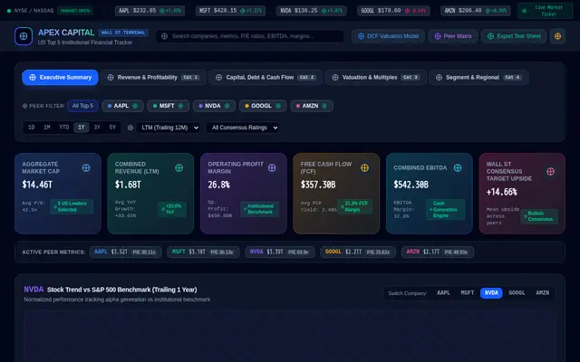
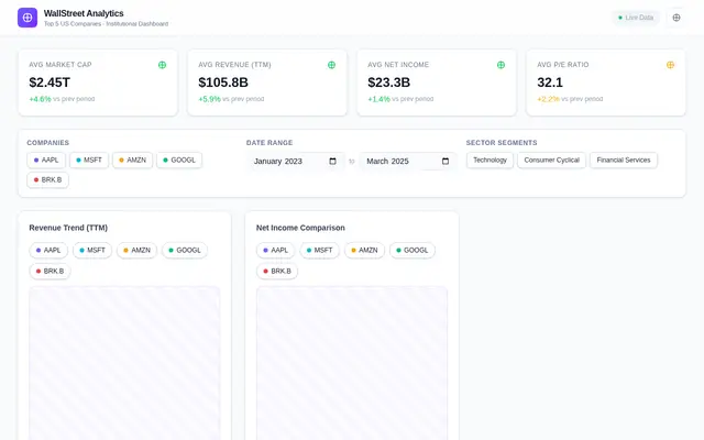
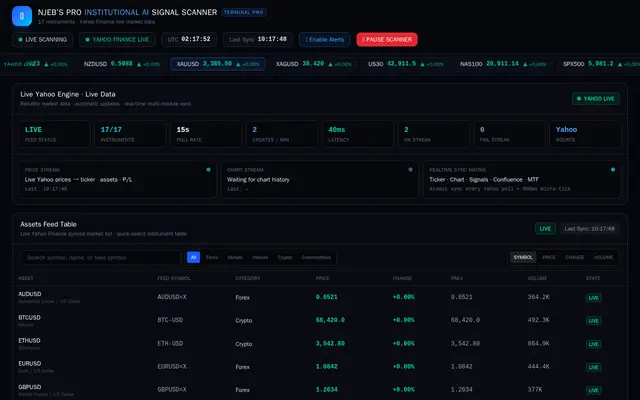
웹페이지2개 모델 참여
Angular용 프로덕션급 UI/UX 프롬프트Here is a structured, production-ready Master UI/UX Prompt tailored for your Angular frontend (`billing-frontend`). You can pass this prompt to an AI code generator, designer, or developer to build the styling layer over your existing Angular structure.
---
---
## Master UI/UX Generation Prompt
Copy and paste the block below into your generation workflow to build the visual design system and components:
```text
Act as a Principal UI/UX Designer and Lead Angular Developer. I have an Angular frontend project named `billing-frontend` with standalone components, configured routing, models, and HTTP services connecting to a Spring Boot REST API at `http://localhost:8080`.
Generate the complete styling (styles.css, HTML templates, CSS modules, and animations) for the existing Angular component architecture following these design specifications:
### 1. DESIGN SYSTEM & COLOR PALETTE
Incorporate the following CSS variables into `src/styles.css`:
```css
:root {
/* Brand Palette */
--color-primary-sage: #52796F;
--color-secondary-slate: #354F52;
--color-dark-charcoal: #2F3E46;
/* Accent & Light Neutrals */
--color-accent-mint: #84A98C;
--color-light-bg: #CAD2C5;
--color-surface-white: #FFFFFF;
--color-surface-card: #F8F9FA;
/* Dark Mode Surfaces */
--color-dark-surface: #1E272C;
--color-dark-card: #283339;
/* Text Colors */
--text-main: #2F3E46;
--text-muted: #6C757D;
--text-light: #F8F9FA;
/* Shadows & Elevations */
--shadow-sm: 0 2px 4px rgba(47, 62, 70, 0.06);
--shadow-md: 0 4px 12px rgba(47, 62, 70, 0.1);
--shadow-lg: 0 10px 25px rgba(47, 62, 70, 0.15);
/* Layout Spacing */
--radius-sm: 6px;
--radius-md: 12px;
--radius-lg: 18px;
--transition-fast: 0.2s ease;
--transition-smooth: 0.35s cubic-bezier(0.4, 0, 0.2, 1);
}
```
### 2. TYPOGRAPHY & FONTS
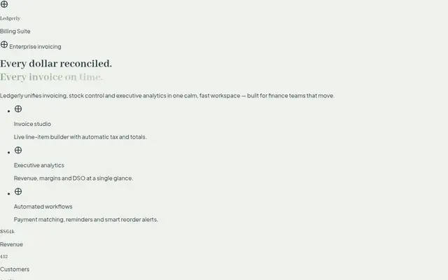
* Primary Serif Font: Import and apply 'Abhaya Libre' (Google Fonts) for display headings (h1, h2, h3, total invoice amounts, visual card headers).
* Body Font: Complement with a clean sans-serif ('Inter' or 'Plus Jakarta Sans') for high legibility in tables, forms, buttons, and navigation labels.
### 3. LAYOUT & ARCHITECTURE
* Container: Flexbox / CSS Grid desktop layout with sidebar width pinned at 260px and dynamic main container.
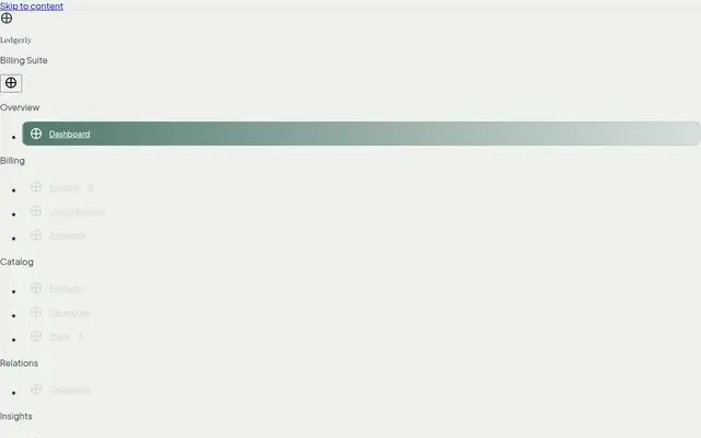
* Sidebar Component (`sidebar.component`):
* Dark background (`#2F3E46`) with subtle gradient borders.
* Interactive navigation links with smooth hover slide-in effects and active highlight indicators using `#52796F`.
* Navbar Component (`navbar.component`):
* Glassmorphism effect: `background: rgba(255, 255, 255, 0.85); backdrop-filter: blur(8px);`.
* Search bar with micro-animations, quick actions dropdown, and profile badge.
* Footer Component (`footer.component`):
* Minimalistic, sticky layout with soft typography using muted tones.
### 4. COMPONENT-SPECIFIC DESIGNS
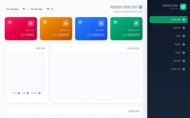
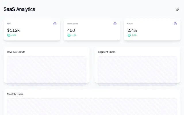
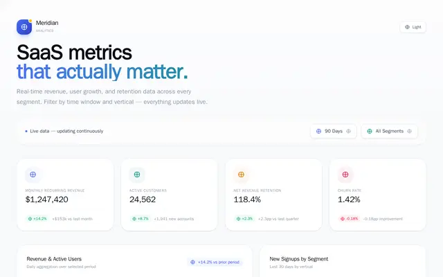
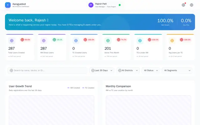
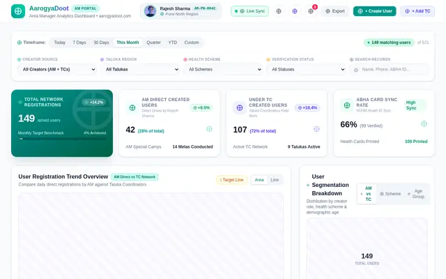
1. Dashboard (`pages/dashboard` & `components/dashboard-card`):
* Executive-grade KPI cards with trend indicators (+/- %).
* Hover states: Vertical translate-y translateY(-4px) with dynamic glow shadow.
* Micro-charts using CSS or Chart.js for sales trends and stock alerts.
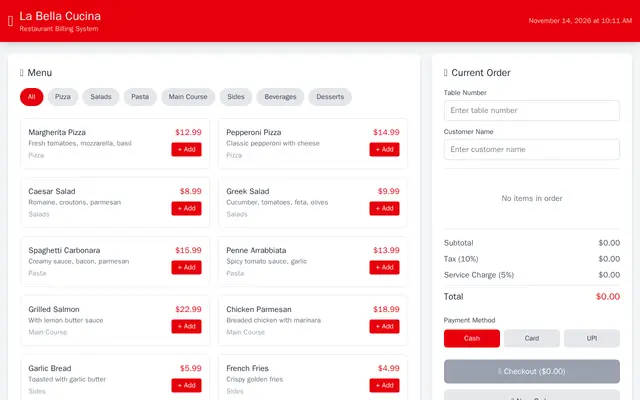
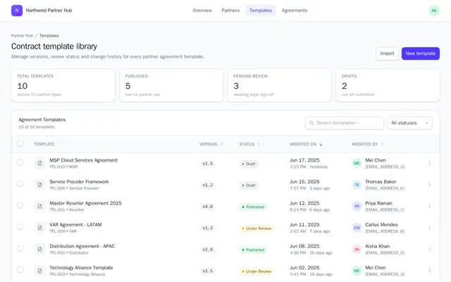
2. Invoices & Create Invoice (`pages/invoices`, `pages/create-invoice`, `components/invoice-card`):
* Professional billing table with hoverable row highlights and action menus (Print, PDF, Delete).
* Dynamic item table builder with automatic total/tax calculations and clean status badges (Paid, Pending, Overdue).
3. Product & Stock Cards (`components/product-card`, `pages/stock`):
* Grid layout featuring responsive cards with image placeholders from `assets/images/`.
* Low-stock badge notifications (`#E63946` muted warning tags).
### 5. ANIMATIONS & INTERACTION
* Page Transitions: Fade-in and gentle slide-up animation (`@fadeSlideIn`) applied on route changes.
* Button States: Ripple effect on click, subtle scale up on hover (`transform: scale(1.02)`).
* Form Controls: Custom focus states with glowing ring outline matching `#52796F`.
* Loading Skeleton Shimmers for async API data fetches before backend response renders.
### 6. OUTPUT REQUIREMENTS
* Provide component templates (HTML) and scoped styles (CSS/SCSS) matching the Angular folder structure:
* Navbar, Sidebar, Footer, Cards
* Pages: Dashboard, Products, Categories, Customers, Invoices, Create Invoice, Payments, Stock, Reports
* Keep all HTML clean, fully semantic, accessible (ARIA attributes), and standard Angular standalone-compatible.
```
---
<ElicitationsGroup message="How would you like to proceed with the frontend generation?">
{/* Reason: Provides actionable next steps to apply this UI design system directly into code files. */}
<Elicitation label="Generate complete CSS theme and global styles file" query="Generate the complete src/styles.css file with the CSS variables, typography imports for Abhaya Libre, utilities, and global animations based on this prompt."/>
<Elicitation label="Generate Dashboard layout and card components HTML/CSS" query="Generate the HTML and CSS for dashboard-card component and dashboard page matching the dark green color palette and Abhaya Libre typography."/>
<Elicitation label="Generate Create-Invoice page with live calculation layout" query="Generate the HTML and CSS for the create-invoice page including the item entry table, payment summary card, and printable styling."/>
</ElicitationsGroup>
```